Introduction
This section focuses on elements that are presented on top of the other content of the page. Consider the case carefully before using pop-ups, since they cause major distractions to user flows. There might be a better solution to the issue at hand than interrupting the user with a pop-up.
Modals
Modals are elements that appear on top of the actual content of the page. They are generally used for actions that user should focus all her attention on before continuing the other tasks. Modals are fired by user’s action, i.e. clicking a button for example.
Pop-ups
Pop-ups are for extreme cases when you need to stop the user and force her to focus her attention on the pop-up. Basically pop-ups are modals which appear without user action. These elements are useful when you need to force user to focus her attention on the information and make her to stop everything else before taking action on the pop-up. Here lies the difficulty and danger of using pop-ups. If you use them to inform user about something that is “nice to know”, you will most likely interrupt the user needlessly. Locating pop-ups in the corners of page does not mitigate the issue. Especially with pop-ups and modals you need throrougly test the solution on smaller mobile devices as well.
Chat views
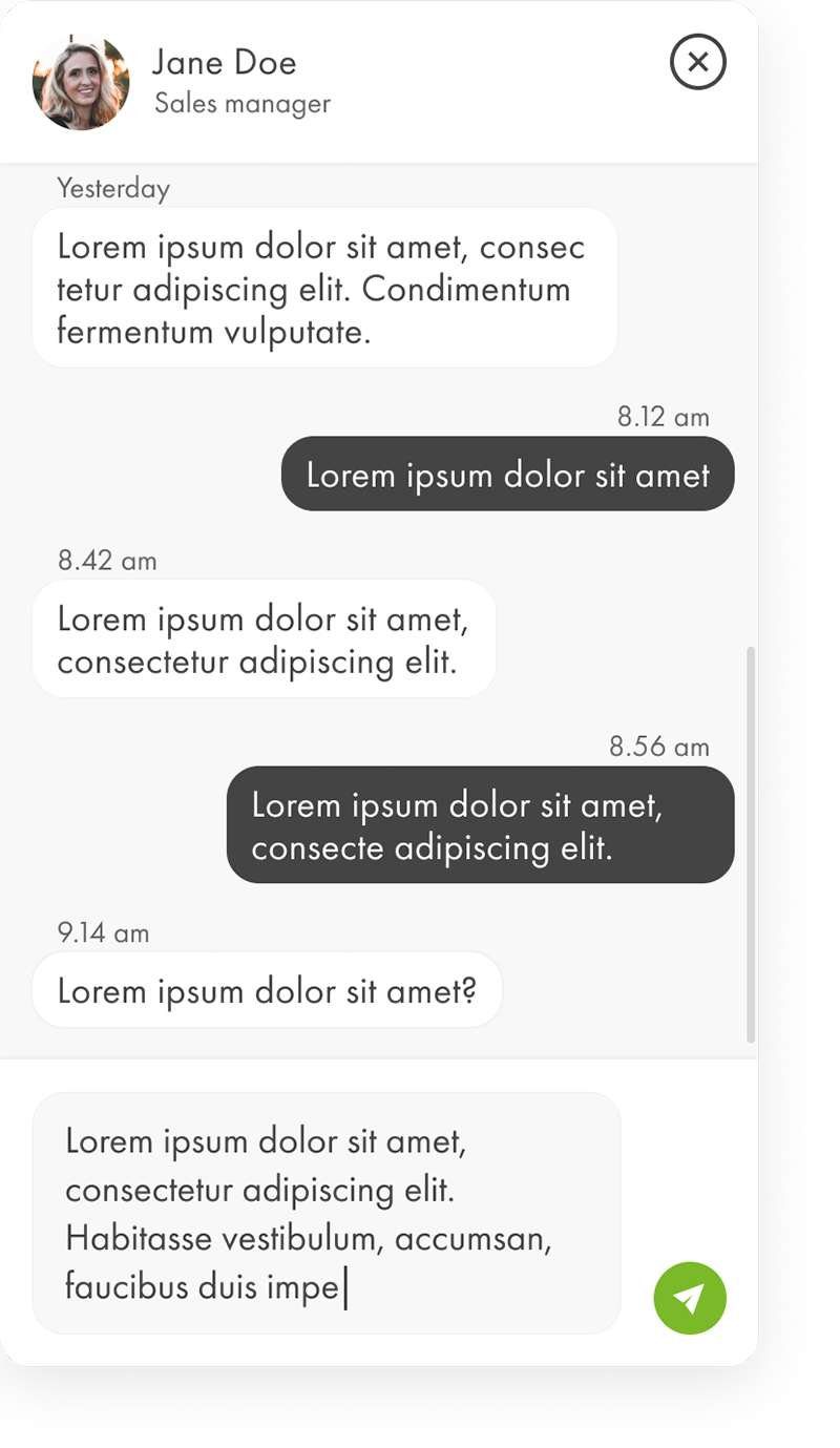
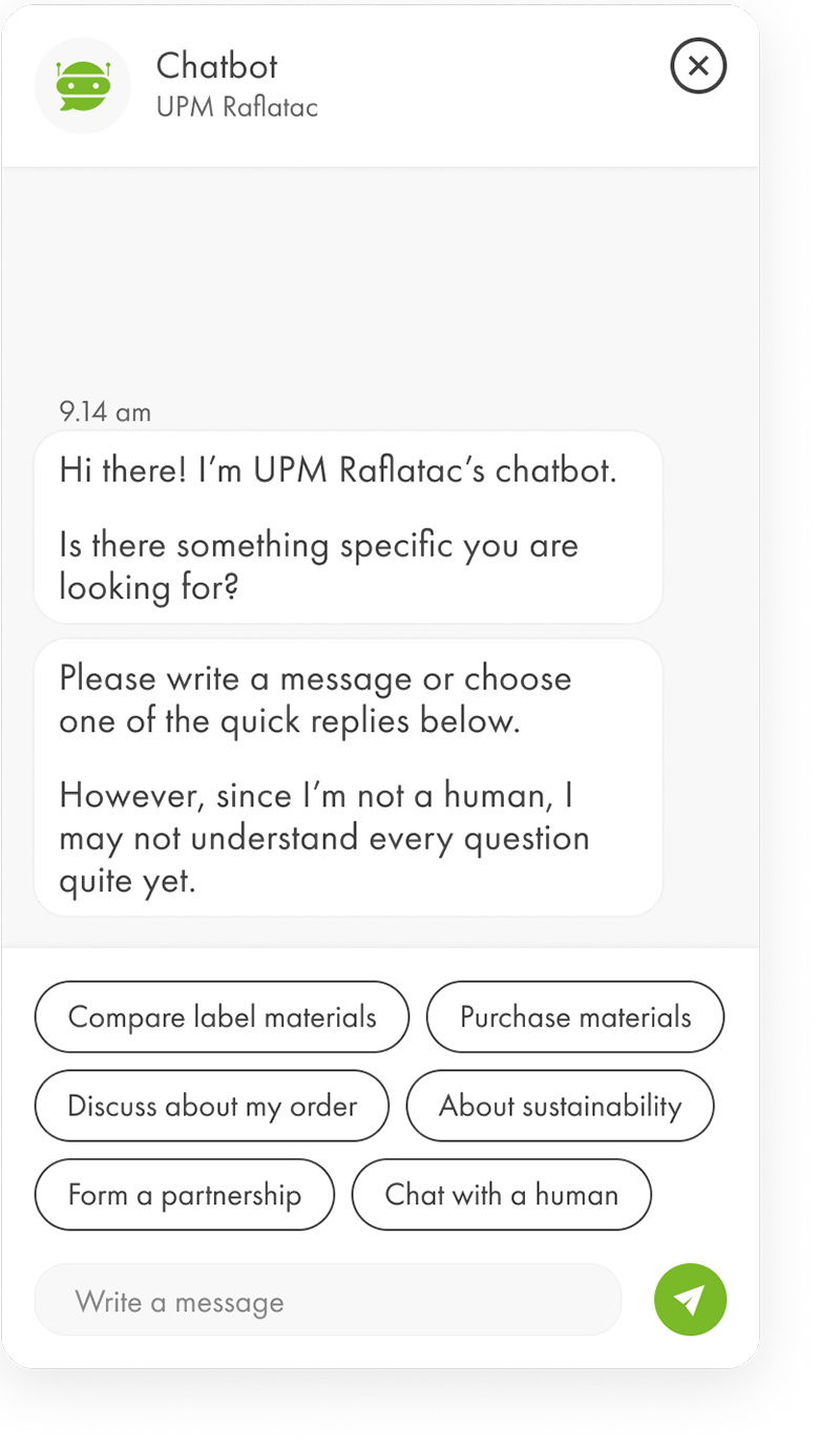
Follow the visual guidelines below and remember to use UPM’s tone of voice in chatbot’s responses. Always test the implementation before launching to make sure you don’t drive user to dead ends in chatbot conversations.


